Industry
Deliverables
Available Light is a studio of world-class lighting professionals whose craft has shaped stages and environments globally. At a pivotal moment in their growth, they came to us for a brand identity and digital presence built to match the depth of their artistry and the ambition of where they're headed.
Introduction
A Brand That Lights Up on Arrival
The experience begins before the homepage loads. An animated logo introduces the Available Light mark in motion, each facet catching color before the full identity reveals itself. The splash transitions seamlessly into the homepage, with the hero headline illuminating in shifting brand colors, setting the tone immediately.
Splash Screen
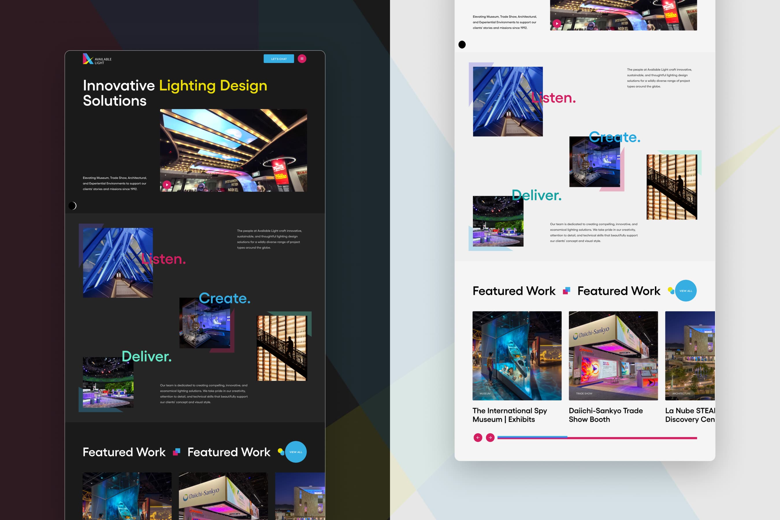
Design That Understands Light
Every visual decision on the Available Light website is rooted in the physics and artistry of light itself. Overlapping color layers mirror the rules of lighting design, where hues blend and breathe together. The brand palette, built from the primary colors of light, carries that logic directly into the interface. A parallax scroll lets the site flow and shift naturally, while illuminated micro-interactions reward every moment of engagement.
Light in Motion
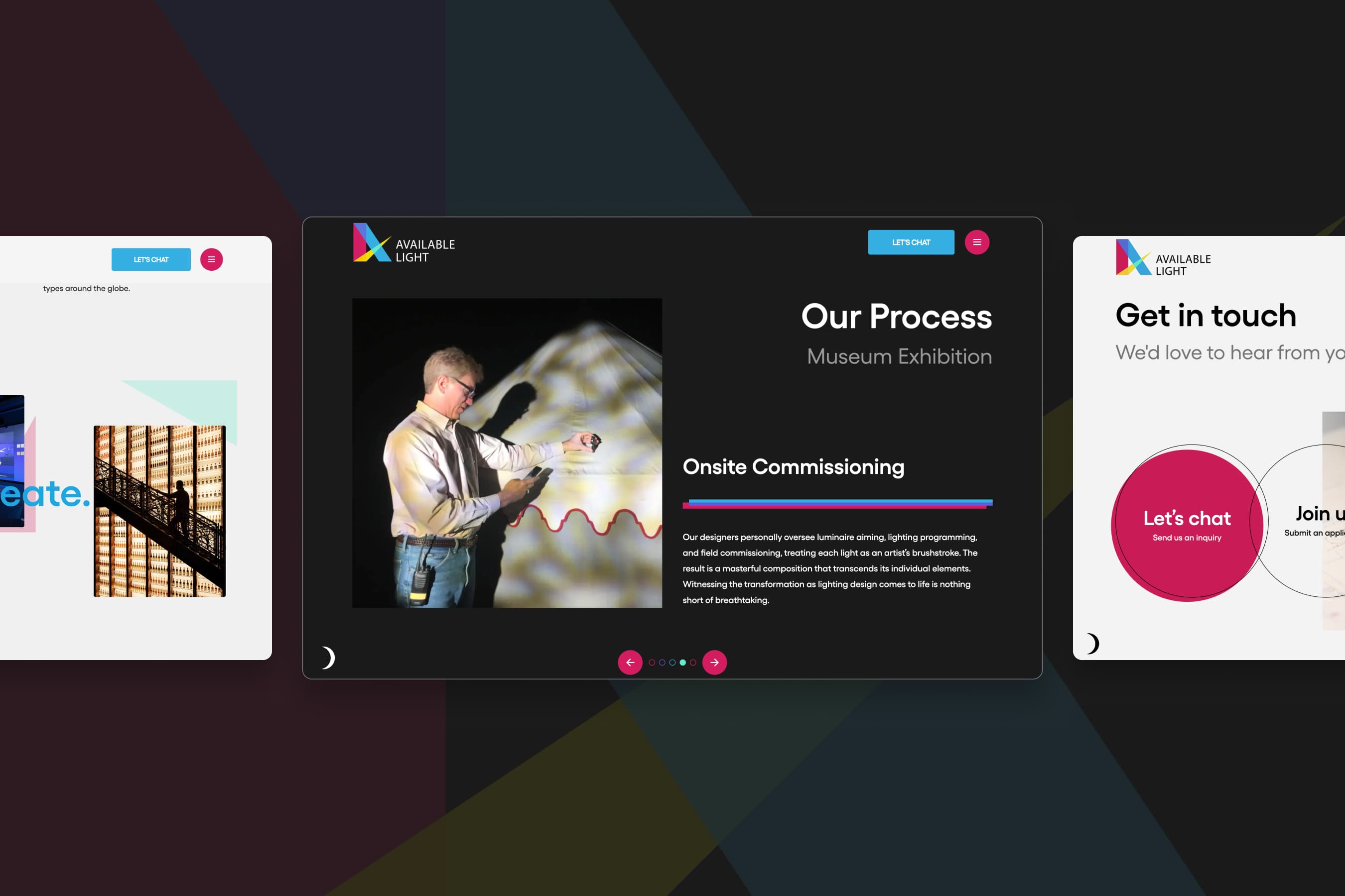
Four Disciplines, Decades of Mastery
The website gives each of Available Light's core disciplines its own dedicated experience. From museum exhibitions to trade shows, architecture to experiential environments, visitors move through rich, immersive pages where real project photography and process detail do the storytelling.
Focus Areas
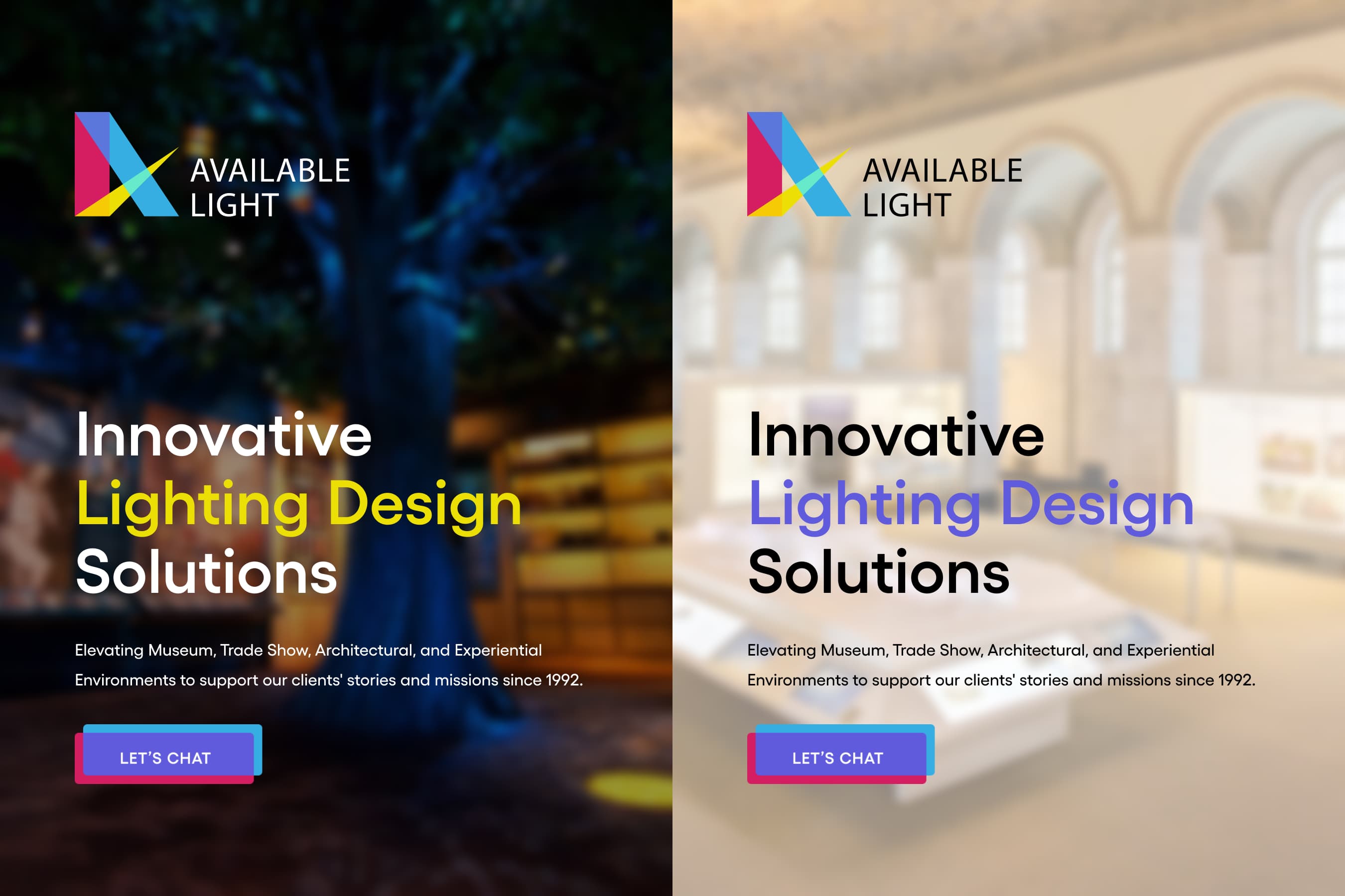
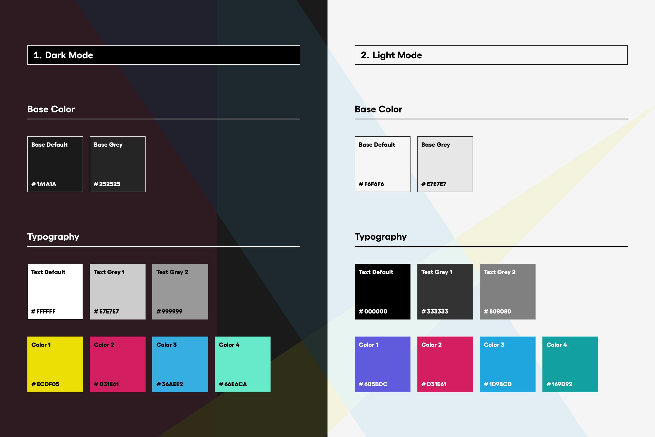
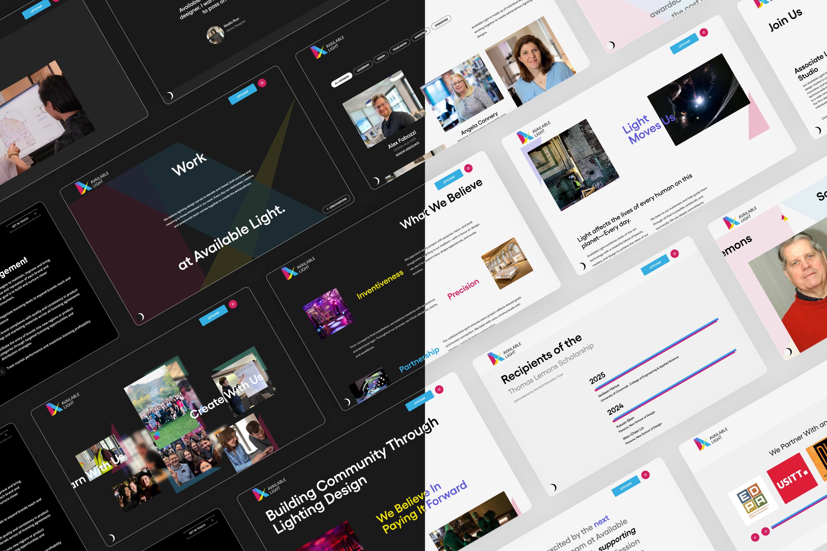
The Brand, In Every Light
For a studio that lives between darkness and brilliance, a single mode was never going to be enough. The Available Light design system was built around two complete visual worlds: a rich dark mode that mirrors the drama of a lit environment, and a clean light mode that reflects precision and clarity. The brand colors, drawn from the primary colors of light itself, shift and adapt across both without losing an ounce of identity. Every type choice, color decision, and UI element carries the same logic: a system as considered as the lighting work it represents.
Light and Dark
Two Expressions, One Voice
Dark mode feels cinematic and immersive, light mode feels precise and editorial. The content, layout, and brand language are identical. The feeling is entirely different. That duality is intentional, mirroring what Available Light does in physical space every day.
Two Modes
A Living Archive of Light
Thirty years of work deserved more than a gallery. Filterable by specialty and tag, each project opens into its own dedicated page rich with photography and the kind of detail that earns trust. A body of work this deep needed a system built to match it.
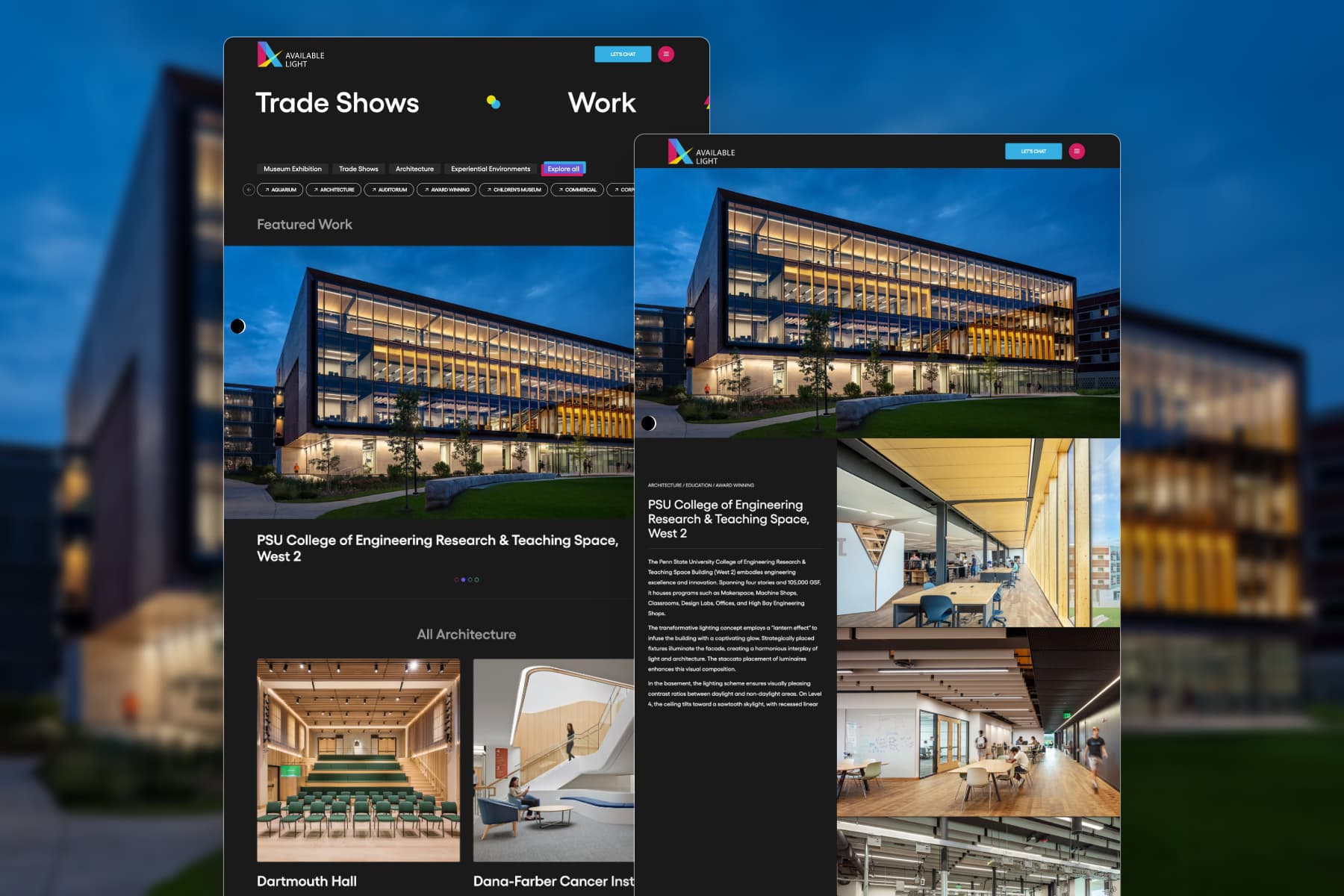
The Portfolio
People Who Live for the Light
Available Light's website gives equal weight to the people behind the work. Filterable team pages and individual spotlights put faces to the expertise, while a dedicated community section reflects a studio that invests deeply in the future of lighting design.
Craft and Care
Focused Contact for Confident Outreach
Through an intuitive navigation and strategic CTAs throughout the site, this clean and distraction-free Contact Us page becomes the natural destination, drawing emphasis to a simple form followed by vital contact details to help visitors confidently reach out.
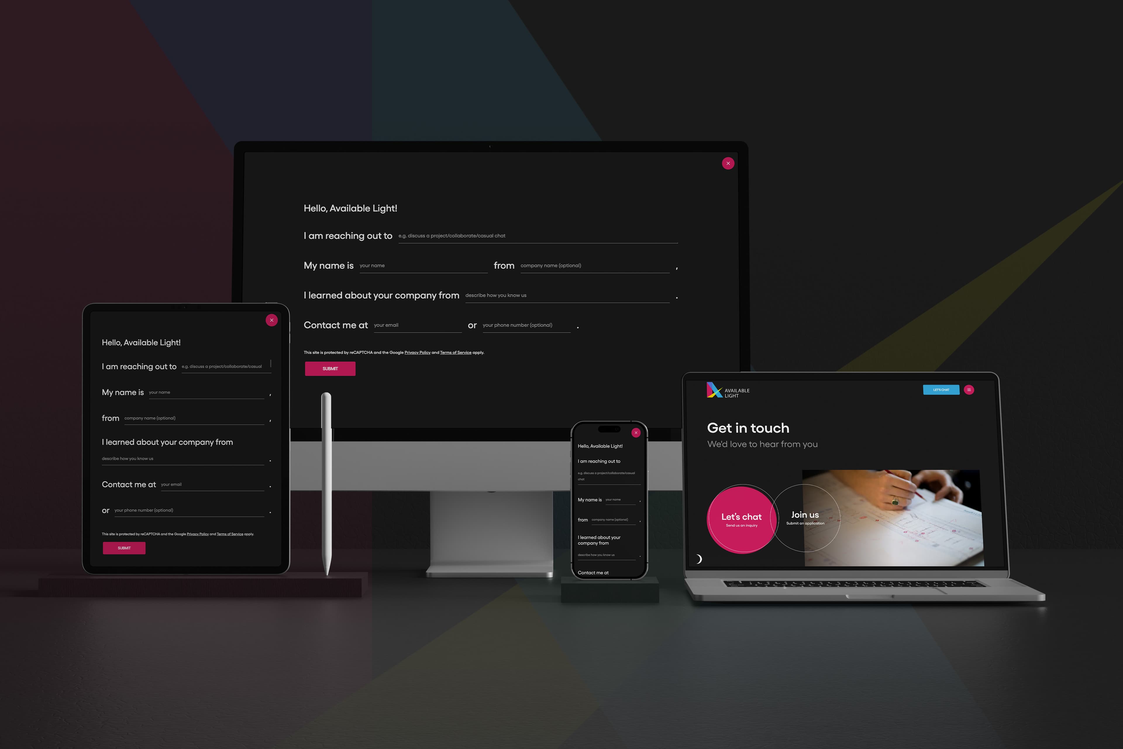
Responsive Forms